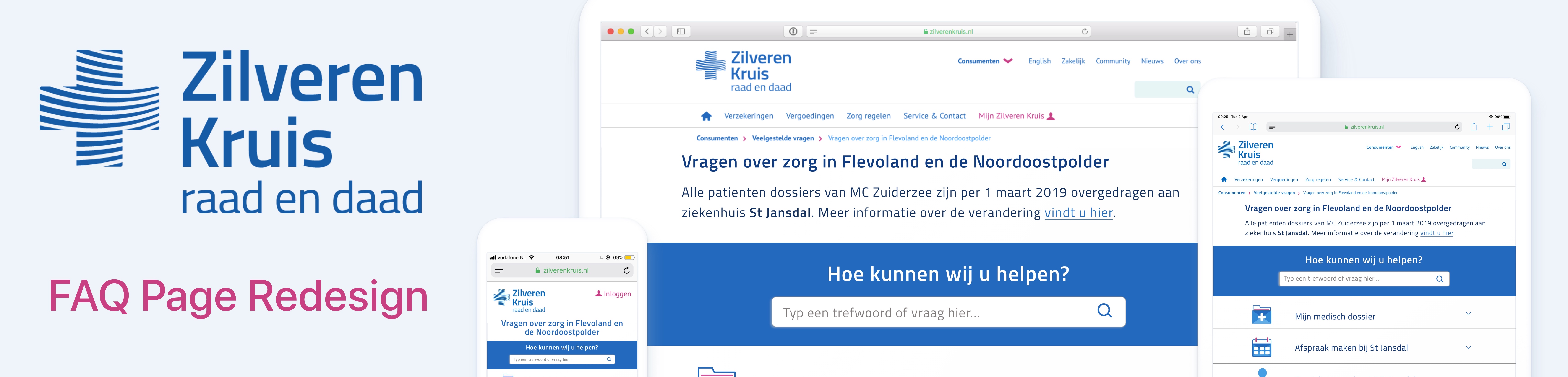
Overview:
Zilveren Kruis is one of the largest healthcare insurers in the Netherlands. After the recent closure of several large hospitals due to bankruptcy, specifically from the group MC IJsselmeerziekenhuizen (Medical Center IJsselmeer Hospitals), Zilveren Kruis was tasked with helping transfer patients to new hospitals within their region to receive care. These new hospitals included the St Jansdal medical group which has three medical centers in the Flevoland province. Due to this abrupt state of change, oftentimes patients were not aware as to where and how they could get care given administrative and locational adjustments.
My Role: I was the lead UX researcher for this 3 week project.
I met with the Head of Care Mediation at Zilveren Kruis to discuss how the FAQ Page for patient migration could be improved to facilitate the goals of helping patients find the information more efficiently meanwhile improving user experience.
Process:
Overview:
Zilveren Kruis is one of the largest healthcare insurers in the Netherlands. After the recent closure of several large hospitals due to bankruptcy, specifically from the group MC IJsselmeerziekenhuizen (Medical Center IJsselmeer Hospitals), Zilveren Kruis was tasked with helping transfer patients to new hospitals within their region to receive care. These new hospitals included the St Jansdal medical group which has three medical centers in the Flevoland province.
Due to this abrupt state of change, oftentimes patients were not aware as to where and how they can get care given administrative and locational adjustments.
My Role: I was the lead UX researcher for this 3 week project.
I met with the Head of Care Mediation at Zilveren Kruis to discuss how the FAQ Page for patient migration could be improved to facilitate the goals of helping patients better find the information they need meanwhile improving user experience.
Process:
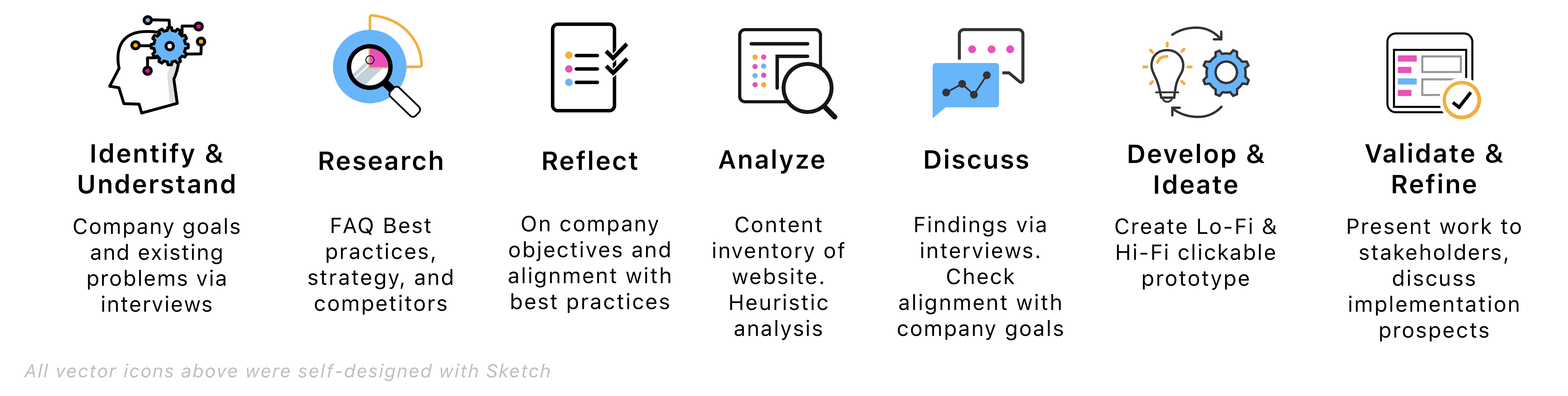
Identify and Understand
Main company goals:
- Help patients of MC Ijsselmeerziekenhuizen utilize the FAQ webpage to quickly find the answers they need related to St Jansdal
- Potentially reduce inbound call volumes and hopefully decongest phone lines so other customers of Zilveren Kruis could be assisted.
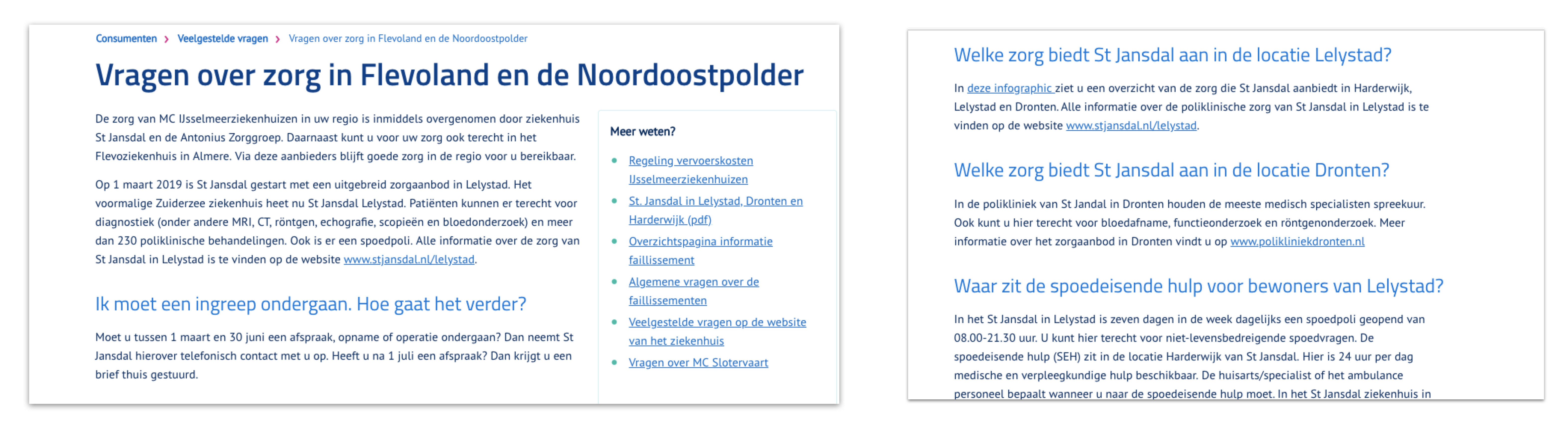
Problem: The FAQ site made it difficult for patients to find the information they needed in a clear and efficient manner. Therefore many patients resorted to calling their insurer to seek out answers related to care at St. Jansdal. In discussion with the Head of Care Mediation, we identified the primary questions people were calling about, checked if the website sufficiently answered these questions, and whether or not the website optimized user experience.
Furthermore, supplemental information provided on the FAQ site, such as links to the St. Jansdal medical group, were insufficient. Although customers of Zilveren Kruis could access the St Jansdal website for information, the information on the St Jansdal website was not readily accessible via the links. To find the correct information on the St Jansdal website was a tedious search process. On a system-based level, on Zilveren Kruis’s main landing page, there was no link to the FAQ page. Nor could the FAQ page be accessed from its path in the location bar on the main menu under the “Consumenten” (Consumers) tab where it was linked to originate.
Another less prioritzied, yet recognized, concern by management was that the FAQ (as well as the Zilveren Kruis website in total) did not have sufficient information translated into English or other languages.
Identify and Understand
Main company goals: For former patients of MC Ijsselmeerziekenhuizen to utilize the FAQ webpage to quickly find the answers they need related to relocation of services to St Jansdal meanwhile reducing inbound call volumes. This, in turn, would hopefully decongest phone lines so other customers of Zilveren Kruis could be assisted.
Problem: The FAQ site made it difficult for patients to find the information they needed in a clear and efficient manner. Thus many patients resorted to calling their insurer to seek out answers related to care at St. Jansdal. In discussion with the Head of Care Mediation, we identified the primary questions people are calling about, checked if the website sufficiently answered these questions, and whether or not the website optimized user experience.
Furthermore, supplemental information provided on the FAQ site, such as links to the St. Jansdal medical group, were insufficient. Although customers of Zilveren Kruis could access the St Jansdal website for information, the information on the St Jansdal website was not readily accessible via the links. To find the correct information on the St Jansdal website was a tedious search process. On a system-based level, on Zilveren Kruis’s main landing page, there was no link to the FAQ page. Nor could the FAQ page be accessed from its path in the location bar on the main menu under the “Consumenten” (Consumers) tab where it was linked to originate.
Another less prioritzied, yet recognized, concern by management was that the FAQ (as well as the Zilveren Kruis website in total) did not have sufficient information translated into English or other languages.
Research
In reflecting on best practices, a good FAQ page should:
• Accurately reflect audience needs (Relevancy)
• Provide easy to use search functionality (Flexibility)
• Be effectively categorized for quick use (Efficiency)
• Provide clear and concise answers
• Have an aesthetically pleasing and minimalist design
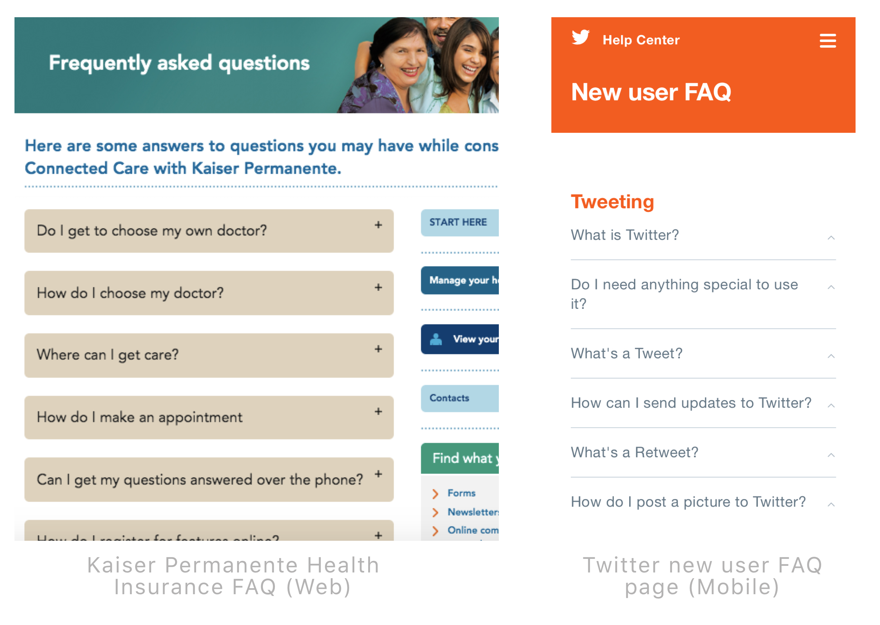
In finding inspiration and insight for a "great" FAQ page, a couple model examples of well-designed FAQ pages that I found were from Kaiser Permanente Health Insurance (a large US-based health insurance company) and Twitter. (See above image) Both of which met the essential best practices for FAQ pages criteria.
In my competitor analysis of other major Dutch health insurers, no other insurer provided an FAQ (veelgestelde vragen) section for information related to patient migration from MC IJsselmeerziekenhuizen to St Jansdal. Therefore, Zilveren Kruis was effectively providing more information than other insurers, albeit not optimally.
In finding inspiration and insight for a "great" FAQ page, a couple model examples of well-designed FAQ pages that I found were from Kaiser Permanente Health Insurance (a large US-based health insurance company) and Twitter. Both of which met the essential best practices for FAQ pages criteria.
In my competitor analysis of other major Dutch health insurers, no other insurer provided an FAQ (veelgestelde vragen) section for information related to patient migration from MC IJsselmeerziekenhuizen to St Jansdal. Therefore, Zilveren Kruis was effectively providing more information than other insurers, albeit not optimally.
Reflect
After researching FAQ best practices, I spoke again with the Head of Care Mediation to make sure that our goals were aligned in moving forward on the FAQ redesign.
Limitations: Unfortunately, as this project was not done internally as an employee of Zilveren Kruis, I had to rely on secondhand correspondence between the Head of Care Mediation, the Issue Manager of the Communication Department, and communication department employees of St Jansdal medical group.
Also due to the private nature of patient data and the time-sensitive process of patient migration, it was not feasible to conduct one-on-one interviews with patients who utilize (or be observed using) the FAQ webpage.
Reflect
After researching FAQ best practices, I spoke again with the Head of Care Mediation to make sure that our goals were aligned in moving forward on the FAQ redesign.
Limitations: Unfortunately, as this project was not done internally as a paid employee of Zilveren Kruis, I had to rely on secondhand correspondence between the Head of Care Mediation, the Issue Manager of the Communication Department, and communication department employees of St Jansdal medical group.
Also due to the private nature of patient data and the time-sensitive process of patient migration, it was not feasible to conduct one-on-one interviews with patients who utilize (or be observed using) the FAQ webpage.
Analysis
The most prominent apects hindering user experience on the Zilveren Kruis FAQ page included the following:
• Answers were written as paragraphs of dense text
• No hierarchy of questions as to which may be more or less important to patients
• No clustering of questions around similar themes
• Important information was not highlighted (e.g. Phone numbers, addresses, etc.)
• Links did not link to an answer to the question. The links connected to the hospital home page where users would have to navigate and search further to find the answers
• Website encouraged calling for answers instead of alternative methods (e.g. Live Chat, send a message, submit a question, etc.)
Discuss
After identifying all the FAQ’s shortcomings, speaking with stakeholders, and thoroughly researching related answers from the St Jansdal website, I created an outline of how to organize the information. This was achieved via categorization of information into themes, questions, and sub-questions using a mental map via Post-It notes. After approval was given on the content redesign, I moved forward with the design process.
Develop & Ideate
I first started by creating a "decision-tree" wireframe of how to best organize and cluster the questions around existing themes. The chosen questions were based off of the original FAQ page and additional questions (that the Head of Care Mediation stated people most often call about) were added.
Prototype
Before beginning with the prototyping process, I created a library of all visual features on the site for reference. This included all the icons I designed for the site which were in sync with the general style of existing icons on the Zilveren Kruis main landing page. Originally the FAQ page did not contain icons. The library also included typography and colors as a style guide for reference. I was not supplied a style guide by the Zilveren Kruis website designers, thus I had to formulate the guide on my own.
I moved straight into a mid to hi-fi prototype as I already had a good idea for the "vision" of the FAQ page. Since the redesign was only a single FAQ element for a niche means of temporary service, elaborate wireframing was not essential.
Tools used: Sketch, InVision (Craft Plugin), Affinity Designer.
Prototype
Before beginning with the prototyping process, I created a library of all visual features on the site for reference. This included all the icons I designed for the site which were in sync with the general style of existing icons on the Zilveren Kruis main landing page. Originally the FAQ page did not contain icons. The library also included typography and colors as a style guide for reference. I was not supplied a style guide by the Zilveren Kruis website designers, thus I had to formulate the guide on my own.
I moved straight into a mid to hi-fi prototype as I already had a good idea for the "vision" of the FAQ page. Since the redesign was only a single FAQ element for a niche means of temporary service, elaborate wireframing was not essential. Tools used: Sketch, InVision (Craft Plugin), Affinity Designer.
Validate & Refine
After completing the redesign prototype, I was able to show the Head of Care Mediation the final result whereby she was very enthusiastic about the changes especially the reorganization, the icons, and the general layout and accessibility. Also (not pictured) I translated the prototype into English as a working example for future website translation possibilities. Unfortunately, I could not meet in-person with the Issue Manager of Communications, but he did view my working prototype and was also very pleased about the result. He used these designs as a forum for discussion with the communications department at the St Jansdal group about future changes that must be made.
Validate & Refine
After completing the redesign prototype, I was able to show the Head of Care Mediation the final result whereby she was very enthusiastic about the changes especially the reorganization, the icons, and the general layout and accessibility. Also, not pictured, I translated the prototype into English as a working example for future website translation possibilities. Unfortunately, I could not meet in-person with the Issue Manager of Communications, but he did view my working prototype via email and was also very pleased about the result. He used these designs as a forum for discussion with the communications department at the St Jansdal group about future changes that must be made.
Future Considerations
I was able to successfully use my skills to design a responsive prototype that stimulated a call for change in the overall design of aspects of Zilveren Kruis's website. But due to both time and financial constraints and the fact that this project was done externally, I could not carry out interviews or usability tests which would optimize the results. Ideally, I would have liked to:
• Sit in on the discussions between the communications department at Zilveren Kruis and St Jansdal group
• Discuss how the FAQ pages Zilveren Kruis's website should be updated regularly
• How to increase the amount of time users spend browsing the FAQ section to increase SEO
• Discuss in-depth how to reduce call volumes by making an effective website design
• Follow the project into its implementation stages and work more closely with other employees at Zilveren Kruis
• Discuss how to make customers, doctors, medical care group professionals more aware of Zilveren Kruis's website resources
Learnings
When I started this project, I didn't realize how uniquely challenging it would be. First off, the information on both the Zilveren Kruis and St Jansdal websites that needed to be aggregated and organized for the FAQ was oftentimes unclear or overwhelming. I had to spend a lot of time searching and browsing both Zilveren Kruis's and St Jansdal's website to find clear, complete answers for the FAQ questions. The answers to the questions I could not find, I had to relay back to the Head of Care and ask via message / email.
Secondly, other challenges I faced were making sense of the information, translating it into layman's terms, scaling down the dense paragraphs of information into "bite sized" answers, understanding how the Dutch medical system operates in itself with relation to health insurers, and translating text, medical terms, and specialist names from Dutch to English.
Lastly, communicating why the FAQ site needed to be designed for usability (not just as an aesthetic makeover) was a really good exercise in applying my reasoning and negotiation skills. Making clear the necessity and urgency for a redesign, especially in my second-language (Dutch) was challenging but in the most rewarding way. This whole process definitely reaffirmed my enthuisasm for UX Research and Design.
Future Considerations
I was able to successfully use my skills to design a responsive prototype that stimulated a call for change in the overall design of aspects of Zilveren Kruis's website. But due to both time and financial constraints and the fact that this project was done externally, I could not carry out interviews or usability tests which would optimize the results. I would have liked to:
• Sit in on the discussions between the communications department at Zilveren Kruis and St Jansdal group
• Discuss how the FAQ pages Zilveren Kruis's website should be updated regularly
• How to increase the amount of time users spend browsing the FAQ section to increase SEO
• Discuss in-depth how to reduce call volumes by making an effective website design
• Follow the project into its implementation stages and work more closely with other employees at Zilveren Kruis
• Discuss how to make customers, doctors, medical care group professionals more aware of Zilveren Kruis's website resources
Learnings
When I started this project, I didn't realize how uniquely challenging it would be. First off, the information on both the Zilveren Kruis and St Jansdal websites that needed to be aggregated and organized for the FAQ was oftentimes unclear or overwhelming. I had to spend a lot of time searching and browsing both Zilveren Kruis's and St Jansdal's website to find clear, complete answers for the FAQ questions. The answers to the questions I could not find, I had to relay back to the Head of Care and ask via message / email.
Secondly, other challenges I faced were making sense of the information, translating it into layman's terms, scaling down the dense paragraphs of information into "bite sized" answers, understanding how the Dutch medical system operates in itself with relation to health insurers, and translating text, medical terms, and specialist names from Dutch to English.
Lastly, communicating why the FAQ site needed to be designed for usability (not just as an aesthetic makeover) was a really good exercise in applying my reasoning and negotiation skills. Making clear the necessity and urgency for a redesign, especially in my second-language (Dutch) was challenging but in the most rewarding way. This whole process definitely reaffirmed my enthuisasm for UX Research and Design.