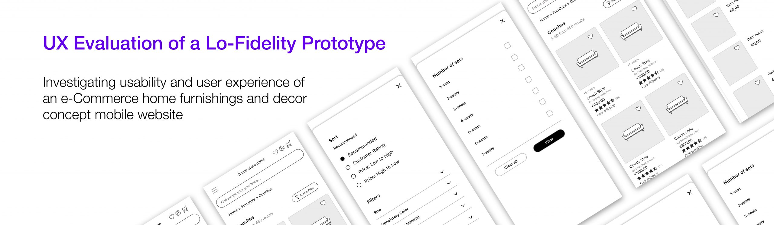
Overview
The purpose of this project was to conduct a user experience (UX) evaluation of a designed low-fidelity webshop prototype that sells furniture, home-goods, and other products related to interior design. This webshop design was presented on a mockup digital lo-fi prototype where participants could view the interface via a browser on their own mobile devices.
My role: I carried out this project in fulfillment for a course on "User Experience Evaluation" in my MSc. in Interaction Design program
Process
The benefit of low-fi evaluation is its practicality, cost-effectiveness, and efficiency in exchange for gaining a wealth of user insights.
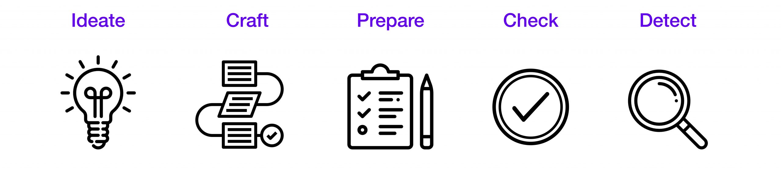
At this stage of the project the main goals were to:
- Ideate and design an effective low-fi prototype
- Craft an organized evaluation procedure and schema
- Prepare tasks that users will complete towards defined goals
- Check the feasibility of each task; and
- Detect and rectify potential design issues via pilot testing.
Overview
The purpose of this project was to conduct a user experience (UX) evaluation of a designed low-fidelity webshop prototype that sells furniture, home-goods, and other products related to interior design.
This webshop design was presented on a mockup digital lo-fi prototype where participants could view the interface via a browser on their own mobile devices.
My role: I carried out this project in fulfillment for a course on "User Experience Evaluation" during my MSc. in Interaction Design program.
Process
The benefit of low-fi evaluation is its practicality, cost-effectiveness, and efficiency in exchange for gaining a wealth of user insights.
The main project goals were to...
• Ideate and design an effective low-fi prototype
• Craft an organized evaluation procedure and schema
• Prepare tasks that users will complete towards defined goals
• Check the feasibility of each task; and
• Detect and rectify potential design issues via pilot testing.
Additional aims of this project were to:
- Reveal valuable insights and information
- Scope out the strengths and weaknesses of the design
- Understand user needs before testing with real users and moving-on to more a refined, high-fidelity prototype.
Main Goals
Before proceeding with the formalization and design of a lo-fi prototype, it was necessary to define exactly what users should be to be able to achieve in terms of actionable tasks within the mockup website.
The primary task for users was that they be able to successfully complete a flow from finding a specific item to purchase, to reaching the confirmation stage of checkout.
The main goals were to identify the following as mentioned by Albert & Tullis (2013):
● Behaviors that prevent user task-completion
● Behaviors that take someone “off course” from said task(s)
● Points of frustration, confusion, or uncertainty among users
● Users disregarding or overlooking certain features or information
● Misunderstandings as to when the user is “finished” with their tasks
● Actions that users may take which deviate from task success
● Misinterpreting pieces of information or content
● Choosing incorrect links to navigate through web pages
Evaluation takeaway: I was able to note problems that may arise, assign a severity level to each problem (how significantly does it impact a user’s experience with the product in achieving their goals), and find practical solutions to remedy these issues.
Research Questions
RQ1: Can users successfully navigate through a prototype of an interior and home-goods webshop, select a couch with three seats, and complete the checkout process using a credit card?
RQ2: How successful were they in this process, what issues did they encounter, and how could the design be improved?
Object of Evaluation
The need for interior furnishings and home decor extends to entire populations, cross-culturally, geographically, and across many demographic dimensions (e.g., age, gender, etc.) At some point or another, people need to buy items to furnish and/or accessorize their home, apartment, or living space.
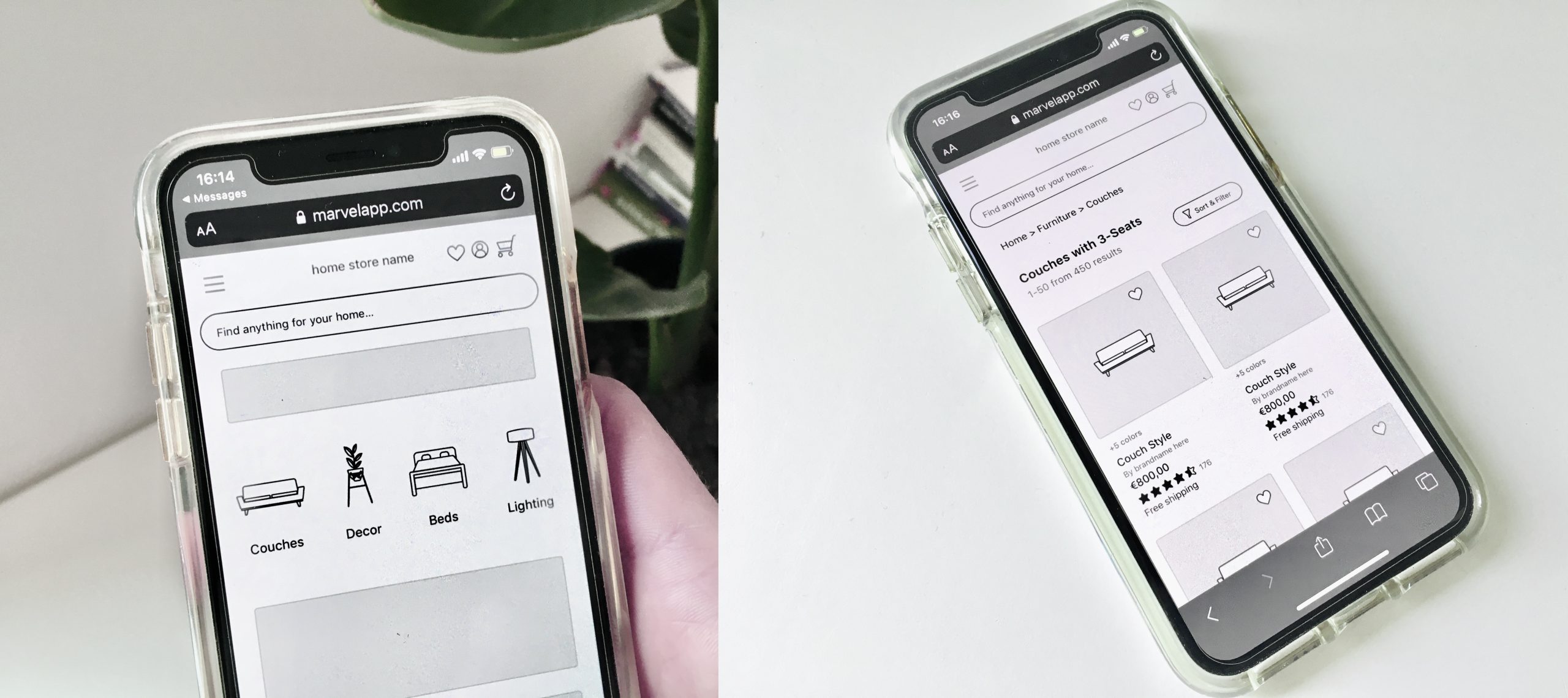
Thus, the website lends itself to inclusivity via catering to a broad audience in contrast to a more fixed e-commerce platform which may sell more niche items (e.g., jewelry, gender-based clothing, children’s toys, etc.) For the sake of simplicity and time, the lo-fi prototype mobile-based website was created digitally using Sketch design software. In total, 15 skeleton screens were designed for the wireframe.
Design and testing approach
A digital lo-fi mockup versus paper sketches for our lo-fi design for the following reasons:
1. The design mimics a “real” website via a relatable use context
2. It’s an efficient manner to transition towards the high fidelity prototype stage
3. The prototype can be easily tested on any participant’s device
4. There were less logistical limitations for deployment
The prototype is illustrated in the images below and an interactive working version of our object can be found via this link
User Journey Flow
The sequence of images below document the user flow from the homepage to finding couches. Users can either (1) tap the hamburger menu icon and proceed through the categorized menu to find couches; or (2) users can simply click the “Couches” icon on the homepage.
Additional aims of this project were to:
• Reveal valuable insights and information
• Scope out the strengths and weaknesses of the design
• Understand user needs before testing with real users and moving-on to more a refined, high-fidelity prototype.
Main Goals
Before proceeding with the formalization and design of a lo-fi prototype, it was necessary to define exactly what users should be to be able to achieve in terms of actionable tasks within the mockup website.
The primary task for users was that they be able to successfully complete a flow from finding a specific item to purchase, to reaching the confirmation stage of checkout.
The main goals were to identify the following as mentioned by Albert & Tullis (2013):
● Behaviors that prevent user task-completion
● Behaviors that take someone “off course” from said task(s)
● Points of frustration, confusion, or uncertainty among users
● Users disregarding or overlooking certain features or information
● Misunderstandings as to when the user is “finished” with their tasks
● Actions that users may take which deviate from task success
● Misinterpreting pieces of information or content
● Choosing incorrect links to navigate through web pages
Evaluation takeaway: I was able to note problems that may arise, assign a severity level to each problem (how significantly does it impact a user’s experience with the product in achieving their goals), and find practical solutions to remedy these issues.
Research Questions
RQ1: Can users successfully navigate through a prototype of an interior and home-goods webshop, select a couch with three seats, and complete the checkout process using a credit card?
RQ2: How successful were they in this process, what issues did they encounter, and how could the design be improved?
Object of Evaluation
The need for interior furnishings and home decor extends to entire populations, cross-culturally, geographically, and across many demographic dimensions (e.g., age, gender, etc.)
At some point or another, people need to buy items to furnish and/or accessorize their home, apartment, or living space.
Thus, the website lends itself to inclusivity via catering to a broad audience in contrast to a more fixed e-commerce platform which may sell more niche items (e.g., jewelry, gender-based clothing, children’s toys, etc.)
For the sake of simplicity and time, the lo-fi prototype mobile-based website was created digitally using Sketch design software. In total, 15 skeleton screens were designed for the wireframe.
Design and testing approach
A digital lo-fi mockup versus paper sketches for our lo-fi design for the following reasons:
1. The design mimics a “real” website via a relatable use context
2. It’s an efficient manner to transition towards the high fidelity prototype stage
3. The prototype can be easily tested on any participant’s device
4. There were less logistical limitations for deployment
The prototype is illustrated in the images below and an interactive working version of our object can be found via this link
User Journey Flow
The sequence of images below document the user flow from the homepage to finding couches.
Users can either (1) tap the hamburger menu icon and proceed through the categorized menu to find couches; or (2) users can simply click the “Couches” icon on the homepage.
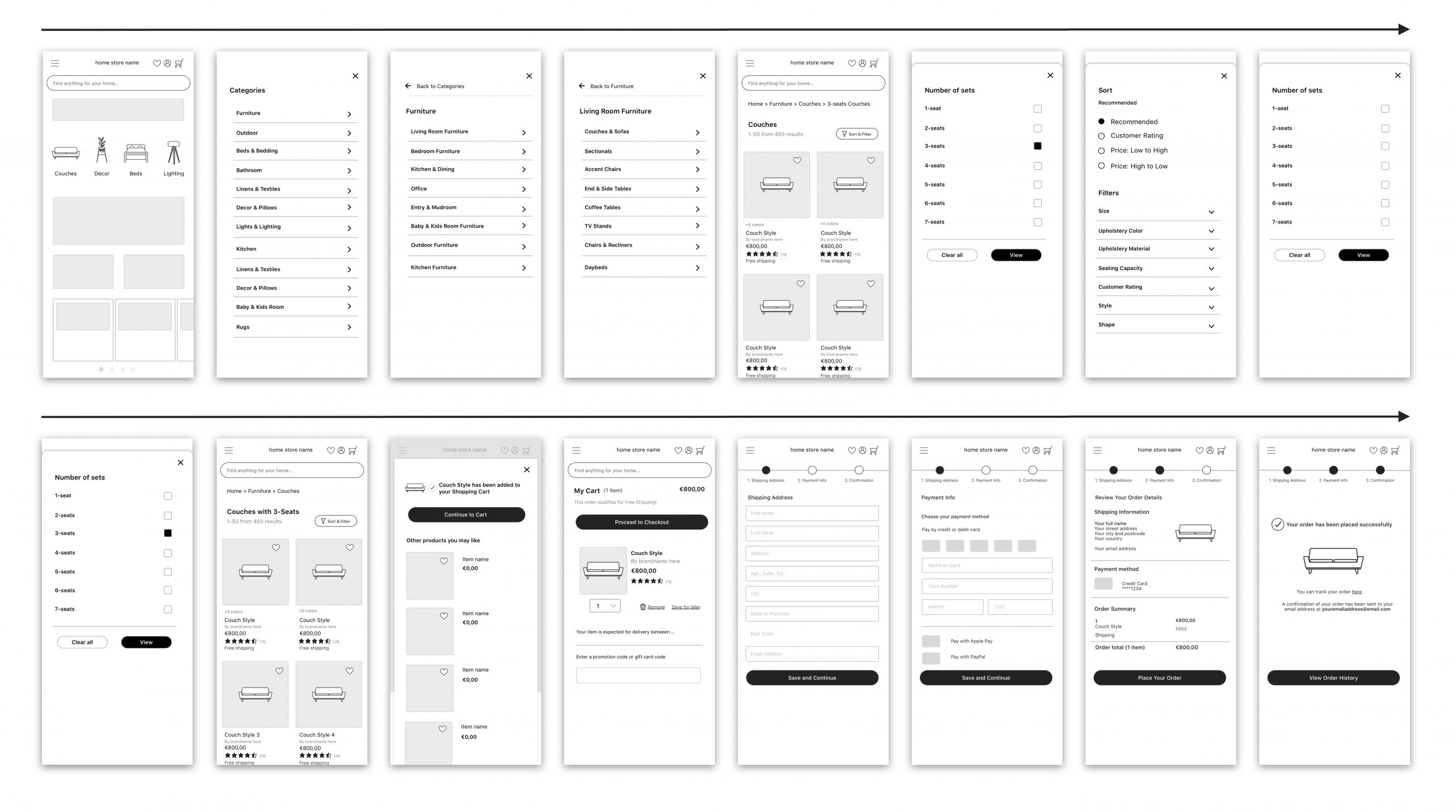
Users can make use of the “Sort & Filter” feature to quickly and easily define the search conditions and results to find a couch with 3-seats. Users then can proceed to add a couch to their Shopping Cart. All couch options that users can choose from are the same (name, price, color, etc.) since the goal was to have users remain focused on completing the task (selection → checkout). The goal of the tasks was not to explore and investigate how users browse among product choices and consider variables that surround choosing a specific product.
After adding a couch to the Shopping Cart, users can proceed towards the checkout process. In this, users must enter their personal shipping information and select their payment method, whereby they are expected to pay by credit card. Users are presented with “Review of their Order Details” and then can place their order which is finalized with a confirmation.
Users can make use of the “Sort & Filter” feature to quickly and easily define the search conditions and results to find a couch with 3-seats. Users then can proceed to add a couch to their Shopping Cart. All couch options that users can choose from are the same (name, price, color, etc.) since the goal was to have users remain focused on completing the task (selection → checkout).
The goal of the tasks was not to explore and investigate how users browse among product choices and consider variables that surround choosing a specific product.
After adding a couch to the Shopping Cart, users can proceed towards the checkout process. In this, users must enter their personal shipping information and select their payment method, whereby they are expected to pay by credit card. Users are presented with “Review of their Order Details” and then can place their order which is finalized with a confirmation.
Understanding the Problem Space
I first decided what elements and features in terms of user interface design, architecture, and functionality, must be present in a successful webshop. Then I researched heavily into best practice principles in adhering to “good” user interface design. A landscape (competitor) analysis was carried out with reference to existing home-goods and furnishing competitor websites.
Best Practices for e-Commerce Websites
• Simple, clutter-free design: Promote easy browsing and navigation; users can digest information easily without distraction
• Intuitive and consistent layout and navigation: The UI should match users' real-world expectations
• Clear visual hierarchy should exist: Elements should be organized in a logical way
• Search bar that stands out: Search bar should always be above the fold; users can quickly find what they need
• Accessible navigation: Users can easily navigate back to the home page; users are aware of their orientation
• Coherent categories: Provide logical product categories, make use of breadcrumbs for users to move through their search.
• Provide Social Proof: Show customer reviews and ratings; They help users assess a product’s worth and trust in the system and its elements.
• Smooth checkout: Minimize the amount of effort and steps required to checkout; make delivery and order confirmation information clear.
Landscape Analysis (Competitor Analysis)
When designing any prototype, it’s extremely valuable to understand the “landscape” of existing competitor products on the market in order to gain strategic insights into the “the features, functions, flows, and feelings evoked by the design solutions of your competitors.” (Adobe, 2020; Nunnally & Farkas, 2016)
In doing so, it helped identify any strengths and weaknesses in the prototype's design and better anticipate the expectations users will have pertaining to the interface design.
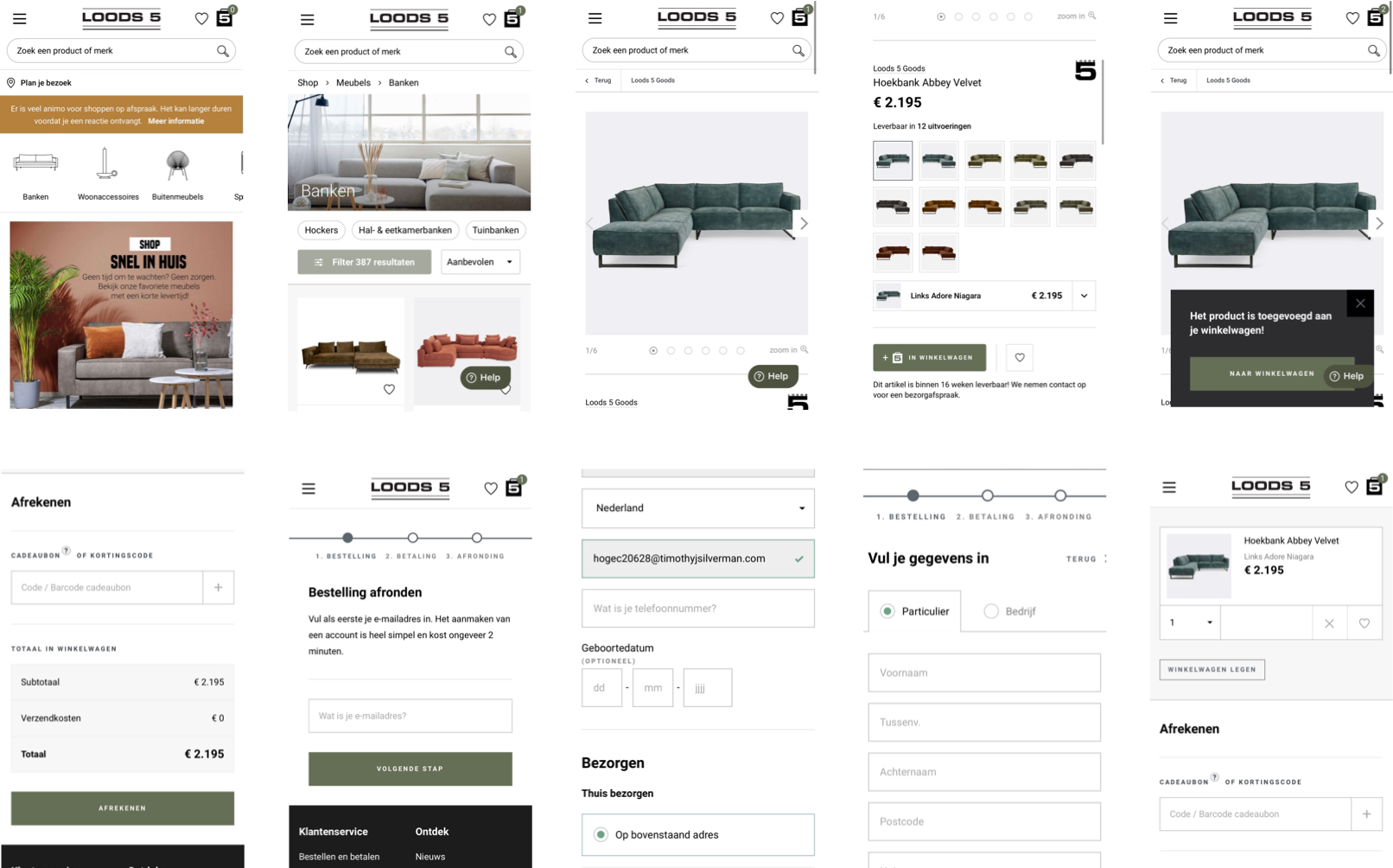
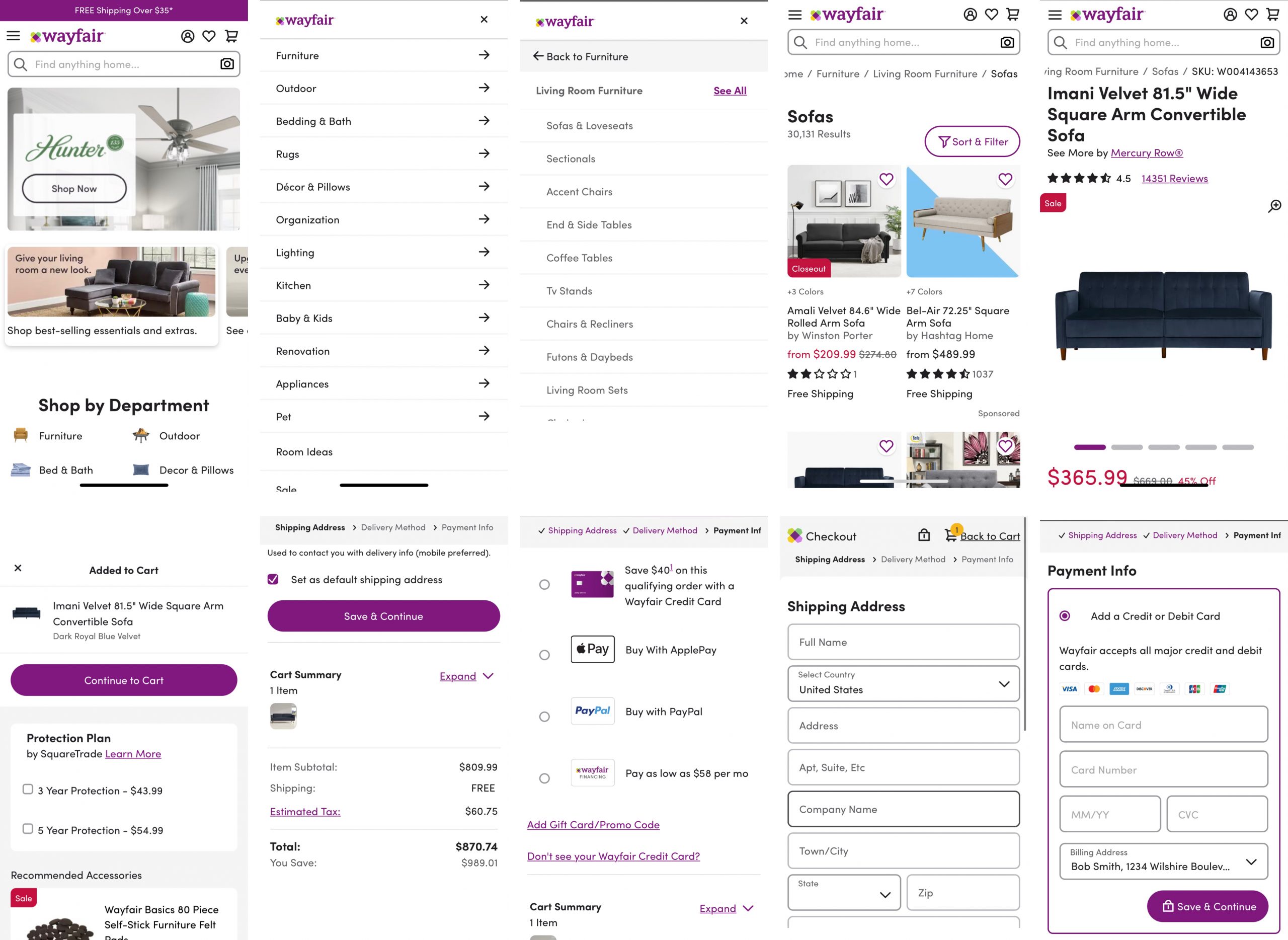
I explored a variety of global sites based in the US and the Netherlands (IKEA, Wehkamp, Loods5, Fonq, Wayfair, Crate & Barrel, etc) Two examples are provided below which illustrate the flow from the home page to the checkout when purchasing a couch.
Loods5: A popular home furnishing store in the Netherlands.
The navigation bar menu with furniture items (banken - couches, woonaccessoires - living accessories, etc) allows for easy thumb movement navigation which should strongly be considered in mobile design. The website has a clean and organized design, it makes use of breadcrumbs to encourage easy navigation, has vivid zoomable product photos, the price is clearly indicated, and the checkout flow is smooth.
Understanding the Problem Space
I first decided what elements and features in terms of user interface design, architecture, and functionality, must be present in a successful webshop. Then I researched heavily into best practice principles in adhering to “good” user interface design. A landscape (competitor) analysis was carried out with reference to existing home-goods and furnishing competitor websites.
Best Practices for e-Commerce Websites
• Simple, clutter-free design: Promote easy browsing and navigation; users can digest information easily without distraction
• Intuitive and consistent layout and navigation: The UI should match users' real-world expectations
• Clear visual hierarchy should exist: Elements should be organized in a logical way
• Search bar that stands out: Search bar should always be above the fold; users can quickly find what they need
• Accessible navigation: Users can easily navigate back to the home page; users are aware of their orientation
• Coherent categories: Provide logical product categories, make use of breadcrumbs for users to move through their search.
• Provide Social Proof: Show customer reviews and ratings; They help users assess a product’s worth and trust in the system and its elements.
• Smooth checkout: Minimize the amount of effort and steps required to checkout; make delivery and order confirmation information clear.
Landscape Analysis (Competitor Analysis)
When designing any prototype, it’s extremely valuable to understand the “landscape” of existing competitor products on the market in order to gain strategic insights into the “the features, functions, flows, and feelings evoked by the design solutions of your competitors.” (Adobe, 2020; Nunnally & Farkas, 2016)
In doing so, it helped identify any strengths and weaknesses in the prototype's design and better anticipate the expectations users will have pertaining to the interface design.
I explored a variety of global sites based in the US and the Netherlands (IKEA, Wehkamp, Loods5, Fonq, Wayfair, Crate & Barrel, etc) Two examples are provided below which illustrate the flow from the home page to the checkout when purchasing a couch.
Loods5: A popular home furnishing store in the Netherlands.
The navigation bar menu with furniture items (banken - couches, woonaccessoires - living accessories, etc) allows for easy thumb movement navigation which should strongly be considered in mobile design. The website has a clean and organized design, it makes use of breadcrumbs to encourage easy navigation, has vivid zoomable product photos, the price is clearly indicated, and the checkout flow is smooth.
Wayfair: A widely used and popular home-goods store in the United States
Similar to Loods5, Wayfair makes use of easily accessible and visible Department / Product categories on their homepage by use of icons. The layout is clean, uncluttered, and easy to navigate. The flow to checkout was smooth and kept users informed of their orientation and progress at all times.
Research Methods
Participant recruitment: Participants were recruited by means of convenience sampling whereby those in the closest proximity and access to the researcher were included. Unfortunately this type of sampling, is not necessarily the most statistically robust or reliable in gathering “representative users.” But, for the sake of this report, it was the most feasible approach given the time and resources available.
Testing methods: The study was based on a formative approach in which the aim was to focus on which aspect of the design worked well or not, and why. (Joyce, 2019)
At this point we are concerned with testing and identifying aspects that need to be changed so that we can gain quick insights and steer the design on the right path. Chosen methods included a concurrent think-aloud (CTA), task completion testing, and post-test questionnaire & SUS.
Current Think Aloud (CTA)
What it is: Direct observation method of user testing that involves asking users to “think-aloud” as they are simultaneously performing a task and elicit answers in real-time.
Why to use it: Helpful for determining user expectations and identifying what aspects of a system are confusing. It also helps researchers understand potential issues users may face and how they are feeling about the product
Task-Completion Testing
What it is: Direct observation method which measures how effectively users are able to complete a given set of tasks. Tasks must be clear, verifiable, realistic, and non-leading.
Why to use it: Provides an easy and quick assessment of the levels of success among users. It helps determine the effectiveness of an interface in helping users accomplish their goals.
Post-Test Questionnaire & SUS (System Usability Scale)
What it is: “Quick and dirty” reliable tool for measuring usability which consists of a 10 item questionnaire with five response options (agree to disagree). SUS measures users' pragmatic satisfaction and usability performance.
Why to use it: It’s a very easy scale to administer to participants, can be used in small sample sizes with reliable results, and can effectively differentiate between usable and unusable systems.
Preparing Participants for the tasks
Test space is set up: (1) participants sent a link to the prototype website and use their own phone and (2) a piece of paper with written task directions is placed nearby for reference. Users were expected to complete the following tasks:
Task 1: Find specified item (a couch)
Task 2: Browse from a selection of couch choices
Task 3: Use the filter and sort option to find a couch with 3-seats Task 4: Add the selected item to their cart
Task 5: Proceed to checkout
Task 6: Enter personal and shipping information
Task 7: Select a payment method (credit card)
Task 8: Check that their order summary is correct
Task 9: Confirm their purchase
Task 10: View their order confirmation
The above tasks are not explicitly stated to the participants. They are discrete tasks and participants were only informed of the task scenaro explicitly stated below:
Task-completion scenario:
(Setting the Scene) “In front of you is a mobile phone and the homepage of the “Home Store” webshop. I would like you to imagine you just moved into a new home and are searching for a new couch. Please complete the following task: Browse through the webstore, select a couch with 3 seats, and complete the checkout process using a credit card.”
Completing the SUS and Post-Test Questionnaire:
After successful completion of all tasks, participants were asked to complete a post-test questionnaire to gather information about his or her demographic characteristics (e.g., age, gender, technological competence, etc.) as well as completing a SUS. The benefits of this approach are that it can be very easily administered to participants as a “quick and dirty” reliable tool to test usability. The SUS data was then calculated using the following methodology. (MeasuringU, 2011; Usability.gov, 2021)
Research Methods
Participant recruitment: Participants were recruited by means of convenience sampling whereby those in the closest proximity and access to the researcher were included. Unfortunately this type of sampling, is not necessarily the most statistically robust or reliable in gathering “representative users.” But, for the sake of this report, it was the most feasible approach given the time and resources available.
Testing methods: The study was based on a formative approach in which the aim was to focus on which aspect of the design worked well or not, and why. (Joyce, 2019)
At this point we are concerned with testing and identifying aspects that need to be changed so that we can gain quick insights and steer the design on the right path. Chosen methods included a concurrent think-aloud (CTA), task completion testing, and post-test questionnaire & SUS.
Current Think Aloud (CTA)
What it is: Direct observation method of user testing that involves asking users to “think-aloud” as they are simultaneously performing a task and elicit answers in real-time.
Why to use it: Helpful for determining user expectations and identifying what aspects of a system are confusing. It also helps researchers understand potential issues users may face and how they are feeling about the product
Task-Completion Testing
What it is: Direct observation method which measures how effectively users are able to complete a given set of tasks. Tasks must be clear, verifiable, realistic, and non-leading.
Why to use it: Provides an easy and quick assessment of the levels of success among users. It helps determine the effectiveness of an interface in helping users accomplish their goals.
Post-Test Questionnaire & SUS (System Usability Scale)
What it is: “Quick and dirty” reliable tool for measuring usability which consists of a 10 item questionnaire with five response options (agree to disagree). SUS measures users' pragmatic satisfaction and usability performance.
Why to use it: It’s a very easy scale to administer to participants, can be used in small sample sizes with reliable results, and can effectively differentiate between usable and unusable systems.
Preparing Participants for the tasks
Test space is set up: (1) participants sent a link to the prototype website and use their own phone and (2) a piece of paper with written task directions is placed nearby for reference. Users were expected to complete the following tasks:
Task 1: Find specified item (a couch)
Task 2: Browse from a selection of couch choices
Task 3: Use the filter and sort option to find a couch with 3-seats Task 4: Add the selected item to their cart
Task 5: Proceed to checkout
Task 6: Enter personal and shipping information
Task 7: Select a payment method (credit card)
Task 8: Check that their order summary is correct
Task 9: Confirm their purchase
Task 10: View their order confirmation
The above tasks are not explicitly stated to the participants. They are discrete tasks and participants were only informed of the task scenaro explicitly stated below:
Task-completion scenario:
(Setting the Scene) “In front of you is a mobile phone and the homepage of the “Home Store” webshop. I would like you to imagine you just moved into a new home and are searching for a new couch. Please complete the following task: Browse through the webstore, select a couch with 3 seats, and complete the checkout process using a credit card.”
Completing the SUS (System Usability Scale) and Post-Test Questionnaire:
After successful completion of all tasks, participants were asked to complete a post-test questionnaire to gather information about his or her demographic characteristics (e.g., age, gender, technological competence, etc.) as well as completing a SUS.
The benefits of this approach are that it can be very easily administered to participants as a “quick and dirty” reliable tool to test usability.
The SUS data was then calculated using the following methodology. (MeasuringU, 2011; Usability.gov, 2021)
Pilot Test Results
The following insights were gathered based on a pilot test of the above testing protocol. These findings help identify areas for improvement in the design meanwhile informing the the future strategy when transitioning to a hi-fidelity prototype.
1. Assessing whether the functions were sufficiently "well-integrated" was difficult due to a lack of comprehensive functionality as would be found in a hi-fi, ready-to-release prototype. If the design and mockup was more "finished," in terms of appearance and usability, a better assessment of user experience would be possible
2. Placeholder images (e.g. the uniform illustration of a couch) lead to some confusion as to whether the couch was a 3-seater or 2-seater couch. In retrospect, placeholder images for couches should have better reflected the actual size / shape of the couch to reaffirm users of their choices.
3. The plus / add product button did not fit in with the participant’s expectations when buying a couch. In this, it would be a rare situation that someone buys more than one couch at a time. Participant stated “maybe if I buy a chocolate bar, but not maybe like a full couch” [tapping plus-plus-plus-plus] … It’s like so lemme just add six couches <laughter>”
4. The progress bar indicator during the checkout flow needed to be better aligned with the stage that the participant is at. There was a bit of confusion as to the participant’s orientation. Participant stated “I’m a bit confused because I assume the filled in ones [circles] are the ones I am at, not the ones I have done.” An improvement to this would be to make the progress bar with circles corresponding to the stage the participant was currently at to create a more logical orientation sequence.
5. The lack of working search bar functionality in the lo-fi prototype proved to be frustrating for users in meeting their expectations. Search is a common go-to function that users rely on, especially on e-Commerce sites, so this feedback was to be expected.
6. Shortcut icons to image categories on the home page yielded positive feedback since users found it useful and efficient to find what they were looking for relative to the assigned task.
7. "Free shipping" was widely perceived as a huge bonus for participants and viewed positively. Even though this task was a complete simulation, the fact that participants were assured explicitly of "Free Shipping" was brought up as a notably positive feature.
Pilot Test Results
The following insights were gathered based on a pilot test of the above testing protocol.
These findings help identify areas for improvement in the design meanwhile informing the the future strategy when transitioning to a hi-fidelity prototype.
1. Assessing whether the functions were sufficiently "well-integrated" was difficult due to a lack of comprehensive functionality as would be found in a hi-fi, ready-to-release prototype.
If the design and mockup was more "finished," in terms of appearance and usability, a better assessment of user experience would be possible.
2. Placeholder images (e.g. the uniform illustration of a couch) lead to some confusion as to whether the couch was a 3-seater or 2-seater couch. In retrospect, placeholder images for couches should have better reflected the actual size / shape of the couch to reaffirm users of their choices.
3. The plus / add product button did not fit in with the participant’s expectations when buying a couch.
In this, it would be a rare situation that someone buys more than one couch at a time.
Participant stated “maybe if I buy a chocolate bar, but not maybe like a full couch” [tapping plus-plus-plus-plus] … It’s like so lemme just add six couches <laughter>”
4. The progress bar indicator during the checkout flow needed to be better aligned with the stage that the participant is at.
There was a bit of confusion as to the participant’s orientation.
Participant stated “I’m a bit confused because I assume the filled in ones [circles] are the ones I am at, not the ones I have done.”
An improvement to this would be to make the progress bar with circles corresponding to the stage the participant was currently at to create a more logical orientation sequence.
5. The lack of working search bar functionality in the lo-fi prototype proved to be frustrating for users in meeting their expectations.
Search is a common go-to function that users rely on, especially on e-Commerce sites, so this feedback was to be expected.
6. Shortcut icons to image categories on the home page yielded positive feedback since users found it useful and efficient to find what they were looking for relative to the assigned task.
7. "Free shipping" was widely perceived as a huge bonus for participants and viewed positively.
Even though this task was a complete simulation, the fact that participants were assured explicitly of "Free Shipping" was brought up as a notably positive feature.
Conclusion
To summarize, the low-fidelity prototype design of the e-Commerce home furnishings webshop proved to be highly usable and recieved a System Usability Score of 80. For SUS scores, a score of 70 is marginally acceptable and 85.5 and above is excellent. Overall users were able to complete their goals via task-completion and did not encounter any negative or frustrating experiences while navigating the website.
Some suggestions for improvement towards a more refined, high-fidelity prototype would be to ensure that user expectations match what is presented to them in the interface in terms of visuals and possible options for functionality. Optimizing the search function, to restate, is absolutely crucial to maintaining high standards of usability and good user experience.
On a more technical level, it would also be worth spending time and energy to dive deeper into meeting accessibility requirements so that the website can be used effectively by all users, regardless of background or limitations.
Conclusion
To summarize, the low-fidelity prototype design of the e-Commerce home furnishings webshop proved to be highly usable and recieved a System Usability Score of 80.
For SUS scores, a score of 70 is marginally acceptable and 85.5 and above is excellent. Overall users were able to complete their goals via task-completion and did not encounter any negative or frustrating experiences while navigating the website.
Some suggestions for improvement towards a more refined, high-fidelity prototype would be to ensure that user expectations match what is presented to them in the interface in terms of visuals and possible options for functionality.
Optimizing the search function, to restate, is absolutely crucial to maintaining high standards of usability and good user experience.
On a more technical level, it would also be worth spending time and energy to dive deeper into meeting accessibility requirements so that the website can be used effectively by all users, regardless of background or limitations.