Overview
ING is one of the largest multinational banking and financial services corporations in the Netherlands and their banking "Bankieren" app serves over 2 million iOS and 2 million Android users daily.
The Bankieren app provides a reliable and secure platform for personal and professional banking that meets modern needs of Dutch and International residents alike in the Netherlands.
Although the app is quite impressive and sets a good example in terms of functionality, like anything, there is always room for improvement in striving to make good products "great."
My role: I was a UX Research Consultant for this 3 week project.
For this project, I conducted a hueristic evaluation of the Bankieren app for iOS based on Jacob Nielsen's principles for good user interface design. I also collaborated with a Senior iOS developer from ING and had the report reviewed by several members of ING's UX /UI team. The report was also distributed to all key members of the Bankieren app team including developers and product owners.
Part 1 of this evaluation includes the most common features used on an “everyday” basis in the ING app; This is limited to the internal operations within the app.
Part 2 of this evaluation entails ING’s newest installation of Push Notifications and its customization in “Settings.”
Assessement criteria: You can find out more about the assessment criteria here via the Nielsen Norman Group.
For this project, I conducted a hueristic evaluation of the Bankieren app for iOS based on Jacob Nielsen's principles for good user interface design. I also collaborated with a Senior iOS developer from ING and had the report reviewed by several members of ING's UX /UI team.
The report was also distributed to all key members of the Bankieren app team including developers and product owners.
Part 1 of this evaluation includes the most common features used on an “everyday” basis in the ING app; This is limited to the internal operations within the app.
Part 2 of this evaluation entails ING’s newest installation of Push Notifications and its customization in “Settings.”
Assessement criteria: You can find out more about the assessment criteria here via the Nielsen Norman Group.
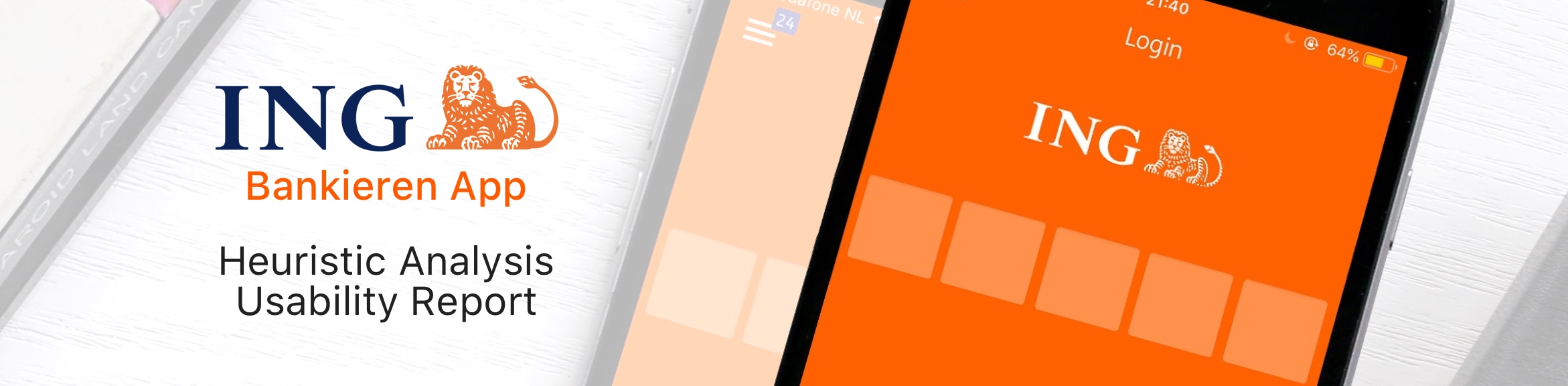
Finding 1
While using the app, users are suddenly logged out of the app via a “Session Timeout” without warning.
Severity: 4/4 (Usability catastrophe, imperative to fix)
Heuristic violated: Visibility of system status; and Error prevention
When using the app for an extended period of time, users are suddenly logged out without warning and must login again. This is a violation of visibility of system status as the user is not given any feedback as to what the status of their session is and how much time they have remaining before they are logged out.
Recommendation: Add an alert that informs the user how much time they have remaining and gives them an option to stay logged in before being logged out and having to re-login and resume their progress.
To add: A timeout alert should only appear when the user has been idle (i.e., there is no interaction or input from the user in the app like swiping, tapping, scrolling, etc.) The “countdown” towards the amount of time a user may remain logged in the app resets with each user interaction with the app. For example, if a user may remain idle for 3 minutes before a “Session Timeout Warning,” each time they interact with the app, the 3 minute timer in the background resets.
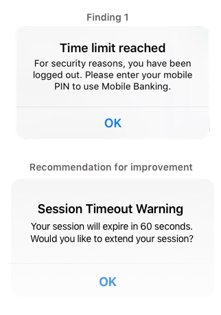
Finding 2
Many English language translations throughout the app are grammatically incorrect and/or confusing. Also, the mixture of Dutch and English on certain screens is inconsistent.
Severity: 3/4 (Major usability issue, important to fix)
Heuristic violated: Match between system and real world; and Consistency
This is a more pervasive problem beyond one location in the app. This is also a larger issue than just translation errors. For native English speakers, the use of idioms may not be problematic. But, a large portion of ING app users may have English as their second (or third, or fourth) language. Therefore, it is essential that there is no room for linguistic misunderstanding of what things mean. Language must be concise and coherent and terms used in the app should match real world conventions.
Example 1, Payment Request Screen: The use of “Which” is grammatically incorrect. It should state either: (1) “How much would you like to request?” or (2) “What amount would you like to request?” Which is only used in context where there is a very small or limited field to choose from. What is used when there is an unknown number of infinite possibilities, but can also be used in place of which. (e.g., “Which account would you like to pay from? A or B?” or “What account would you like to pay from?”) Thus, a corrected prompt on the Payment Request screen should be "What amount would you like to request?"
Example 2, What the App Offers: The “Service” option in the menu, has an overview of “What the app offers.” In the slideshow of images, the examples are a combination of Dutch and English (e.g. English descriptions with a Dutch screen example). The use of “comes and goes” as an idiom is used incorrectly. “Comes and goes” means: to exist (or happen) for a short time and then go away; or arrive at a place and then leave again. Therefore, metaphorically, it infers that money has a mind of its own in entering or leaving your bank account with no emphasis on one’s personal control of the app and their finances. Instead it should reaffirm that the user is in control of the events that are happening and should say something like “You’re in charge.”
Additional Recommendations: A native English speaker who preferably has experience teaching English as a Second Language and/or a degree (or certificate) emphasizing academic English writing should check the app for all English language-related issues. Someone who merely speaks English is not qualified enough to analyze grammatical errors and explain why and how they must be changed.
Additional Recommendations: A native English speaker who preferably has experience teaching English as a Second Language and/or a degree (or certificate) emphasizing academic English writing should check the app for all English language-related issues. Someone who merely speaks English is not qualified enough to analyze grammatical errors and explain why and how they must be changed.
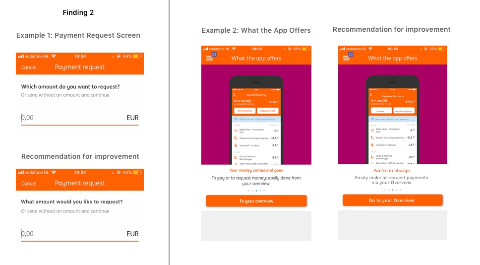
Finding 3
There is no available balance viewable for Credit Cards from the Overview screen, meanwhile the status of other accounts is available.
Heuristic violated: Visibility of system status; and Consistency
Severity: 3/4 (Major usability issue, important to fix)
It’s difficult for users to know whether or not they have an outstanding balance on their credit card unless they tap on their credit card which directs to another screen. It is inconsistent to have available balances visible for accounts but not for credit cards in the Overview. Users should know what is going on at all times and, especially with regard to personal finances, feel like they are informed and in-control.
Recommendations:
A feature that many other major banks utilize, an available balance of the credit card should be visible right next to the credit card on the Overview screen. It should clearly state what the outstanding balance is (€0 meaning no outstanding payments, greater than €0 meaning customer has outstanding payments, and less than €0 meaning customer has no outstanding payments, but the credit card company owes customer money.
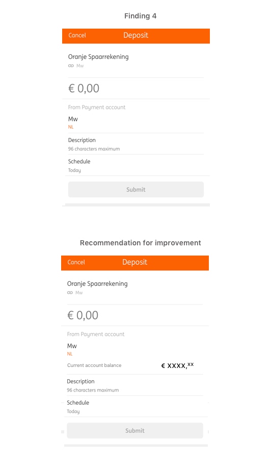
Finding 4
There is no account balance listed when making deposits into savings account.
Severity: 3/4 (Major usability issue, important to fix)
Heuristic violated: Recognition over recall
When selecting a savings account, to make a deposit. It’s unclear how much money one can transfer into their Savings Account because the balance on one’s Payment Account is not listed.
Therefore users have to go back to an Overview to see how much money is available, remember that amount, then make an appropriate decision on how much one can transfer to deposit
Recommendations: When the account name is listed, also provide an available balance below for reference.
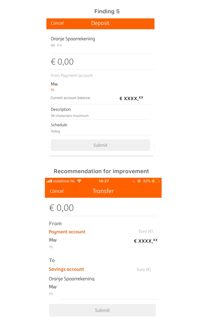
Finding 5
The order of operations is confusing on the Deposit Screen. Also the use of the term “Deposit” is used incorrectly and should be “Transfer.”
Severity: 3/4 (Major usability issue, important to fix)
Heuristic violated: Match between system and the real world; and Consistency
The order of operations has the destination of the transfer (Oranje Spaarrekening) listed first and the source (From Payment account) at the bottom. This is confusing. The sequence of events is normally that users transfer (1) from one account (2) to another account or recipient.
Also, operating on conceptual models of banking, normally people “transfer” money from one account to another (internal) meanwhile making “deposits” from an outside (external) source of funds (e.g., Paychecks, cash deposits, etc.)
This is a violation of consistency in that actions should follow real-world conventions and leverage people’s existing schemas (How they normally expect things to go based on what they know and their prior experiences).
Recommendation: Rearrange the order of items as to where the money comes from (Payment Account) and where it will be transferred to (Savings Account).
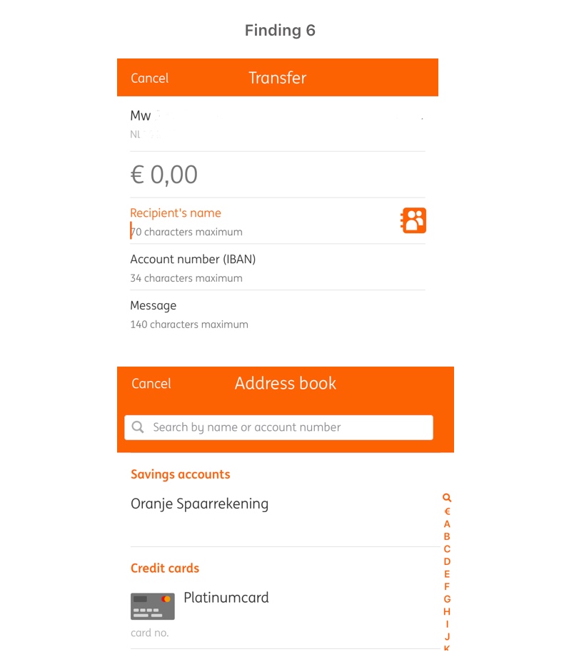
Finding 6
Users cannot add “Credit Card” or “Savings Account" in the “Recipient’s Name” field for Transfers via typing.
Severity: 3/4 (Major usability issue, important to fix)
Heuristic violated: Consistency; & Flexibility and Efficiency of use
When attempting to add Credit Card or Savings Account as a recipient, users cannot take a shortcut by typing the names “Credit Card” or “Savings Account.” Instead they have to tap on the Address Book to find and add them as a recipient. This compromises a user’s efficiency.
Recommendations: Allow users to add “Credit Card” or “Savings Account” as recipients via typing into the “Recipient’s name” field.
An additional suggestion would be to change “Oranje Spaarrekening” to “Savings Account” in the Address Book so users can type the recipient in English.
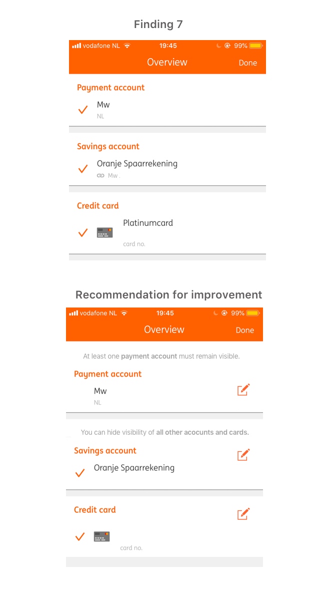
Finding 7
Not all accounts can be edited and/or removed from view in the secondary Overview screen (Overview screen “Edit mode”)
Severity: 2/4 (Minor usability problem, Fix if there is time)
Heuristic violated: Visibility of system status; & Error prevention
After selecting the “eye” icon via the “Overview” section of accounts available, users are directed to their accounts Overview. But, now each account has a check mark on the left side of it. If one tries to select their first “Payment Account” by tapping the check mark, nothing happens and there is no explanation as to why this account cannot be selected.
This does not keep user informed as to what is going on and feels like a wasted effort tapping on an icon that does not respond; This being a violation of Error Prevention.
Recommendation: Remove the checkmark altogether for accounts that cannot be hidden and provide some sort of explanation. Also provide guidance as to what the action checking / unchecking does, such as a small explanation above the accounts (“At least one payment account must remain visible” and “You can hide visibility of all other accounts and cards.”) Users want to feel informed and in control as to what’s going on at all times.
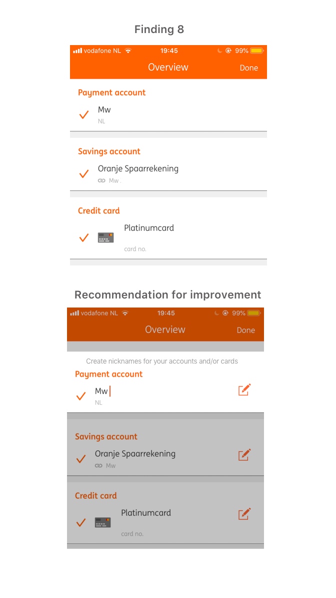
Finding 8
It is not clear that the account names can be edited via the second Overview screen (This appears when tapping the eye icon in the upper right corner of the main Overview page.) It’s also ambiguous what editing the account names actually achieves.
Severity: 2/4 (Minor usability problem, Fix if there is time)
Heuristic Violated: Visibility of system status
After selecting the “eye” icon via the “Overview” section of accounts available, one is directed to another “Overview” page. I only discovered that an edit function was available to rename the accounts and credit card by mistakenly tapping on the account name. If I did not do so, I would have never known account names could be edited / renamed.
Also, when editing an account name, it’s not clear as to if the name change also affects changing one’s personal information details in “Settings” (e.g., Given name on bank account) or just creating an account “nickname" which has no other consequences.
Recommendation: Provide an “Edit” icon next to the accounts to make clear that the option is available. Better and more clearly state the purpose and function of the page or else it communicates to the user that it’s just another, redundant Overview page. State for example: “Create a nicknames for your accounts and/or cards.”
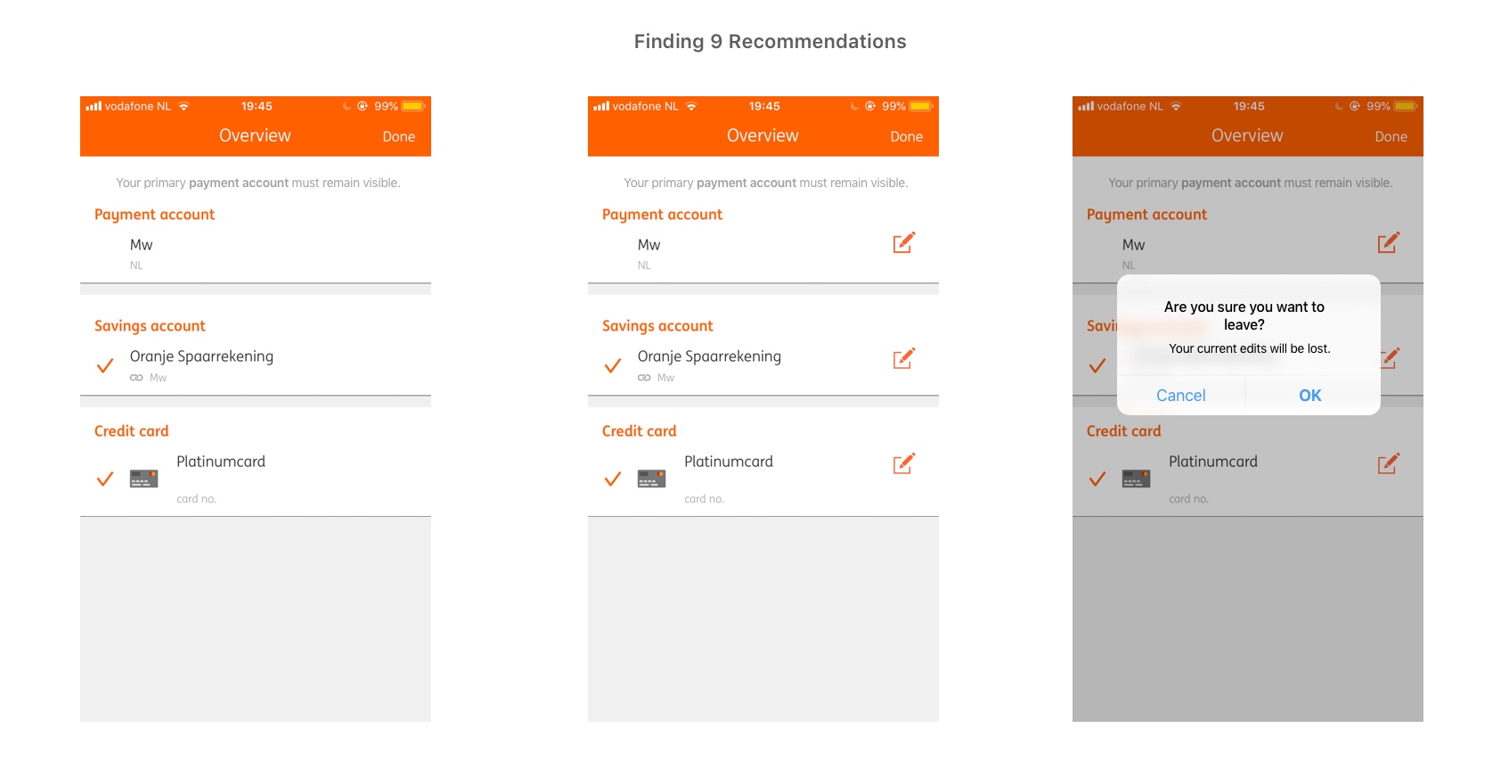
Finding 9
If edits are made to account and/or card names and the user accidentally swipes back to the main Overview without selecting “Done,” it does not allow them to recover from their mistakes.
Severity: 2/4 (Minor usability problem, Fix if there is time)
Heuristic Violated: Help users recover from errors; and Error prevention
Recommendation: If a user accidentally swipes back while in edit mode of the Overview, make sure the user truly wants to leave the page via a pop-up alert. This alert should state something like “Are you sure you want to leave? Your current edits will be lost.”
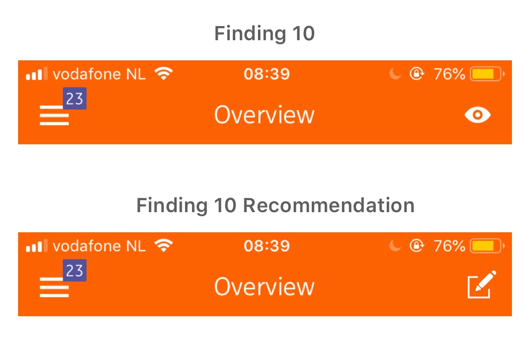
Finding 10
Eye icon on the “Overview” screen is unclear as to its purpose.
Severity: 2/4 (Minor usability problem, Fix if there is time)
Heuristic violated: Consistency of standards
On the main Overview page of accounts and cards, there is an “eye” icon in the upper right corner. It’s not really clear what the eye symbolizes. On first guess, it would be some sort of “view” function, but in actuality, it launches another Overview screen where account visibility and account names can be edited.
Recommendation: A better suited icon would be an “edit” icon as it symbolizes what actions may be possible when the icon is tapped. (i.e., Editing the overview)
Key Findings Part 2: Push Notification Settings
Push notifications have been one of ING’s most highly requested features. The purpose of these notifications is to help customers be aware and informed of:
- Money being deposited into their account (e.g., salary, refunds, etc.)
- Money being deducted from their account (e.g., payments, direct debits, etc.)
- When customers hit personally defined “low” balance in their account
- When customers have been reimbursed via a Payment Request to another party
Analysis: Although Push Notifications are a valuable feature, there were several shortcomings when it came to the overall experience when adjusting the Push Notifications settings. More so, it was unclear as to why customers (who were not advocating previously for push notifications) should make use of this feature by adopting it into their everyday use of the app.
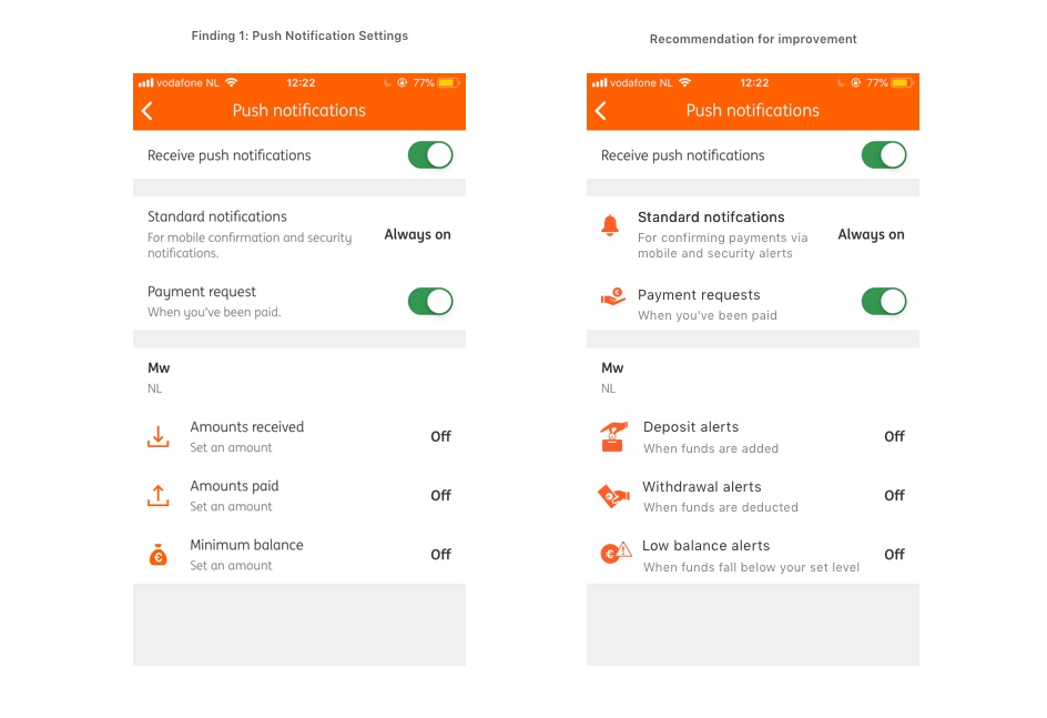
Finding 1
Titles and descriptions within the Push notification settings are sometimes ambiguous and confusing.
Severity: 3/4 (Major usability issue, important to fix)
Heuristic violated: Match between system and real world; & Consistency
In accessing the Push notification settings via “Settings,” several headers are either grammatically incorrect or ambiguous such as:
- “Payment request” should be “Payment requests” (as it refers to more than one request).
- Amounts received, Amounts paid, and Minimum balance are non-descriptive. It’s not exactly clear what actions they refer to.
- Sub-text description for features “Amounts received,” “Amounts paid,” and “Minimum balance” which states “Set an amount” or “Set: €0 or less” is ambiguous.
- Under “Standard notifications,” the sub-text which mentions “mobile confirmation” is unclear. What does “mobile confirmation” refer to
- Under “Standard notifications” and “Payment request,” the descriptions end with a period, but are not complete sentences, thus they do not need periods.
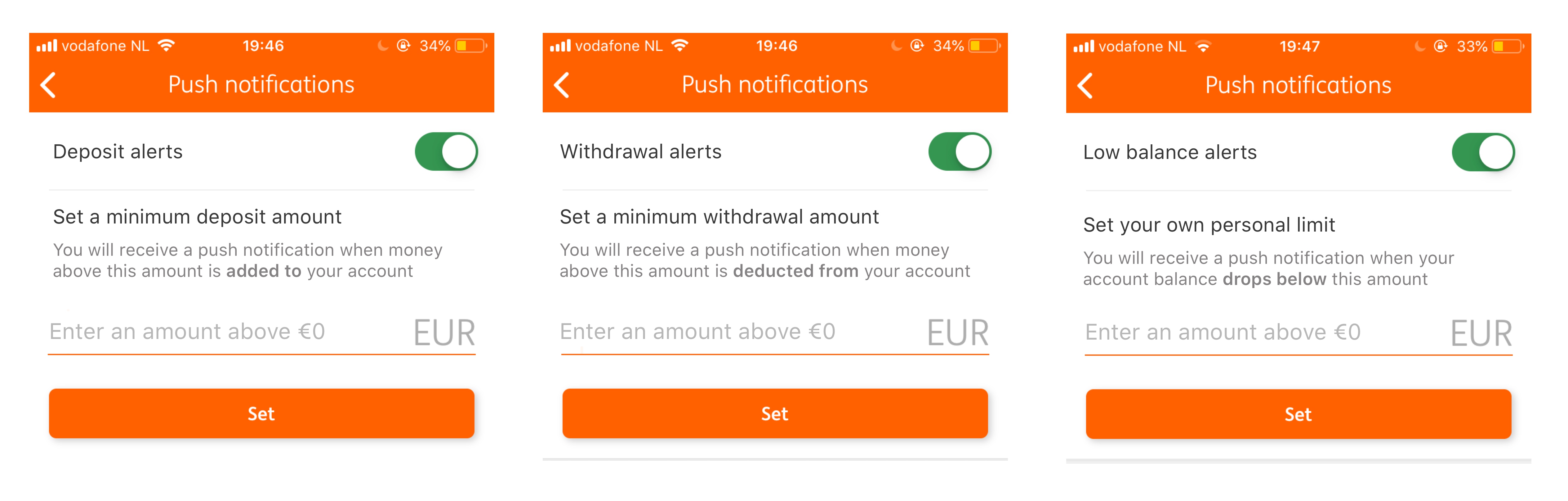
Recommendations: If you want users to make use of Push Notifications, the feature needs to stress urgency and importance. The language used to describe the features available should avoid being ambiguous and passive and, instead, emphasize a proactive nature.
The first issue is with the word “Amounts” as it is too general and vague. Since “Amounts received” refers to notifications when money is added into one’s account, a better suited title is “Deposit alerts.” Money is arriving from an external source and deposited into a customers account.
As “Amounts paid” refers to when money is withdrawn or removed from an account, a better title would more accurately be “Withdrawal alerts.” Money is taken out of customer’s account. “Alert” is a better term as it has a stronger sense of urgency in that withdrawals are more consequential than deposits.
“Minimum balance” is also somewhat vague. The purpose is to alert people when their available funds are getting low. Thus a better title would be “Low balance alerts.”
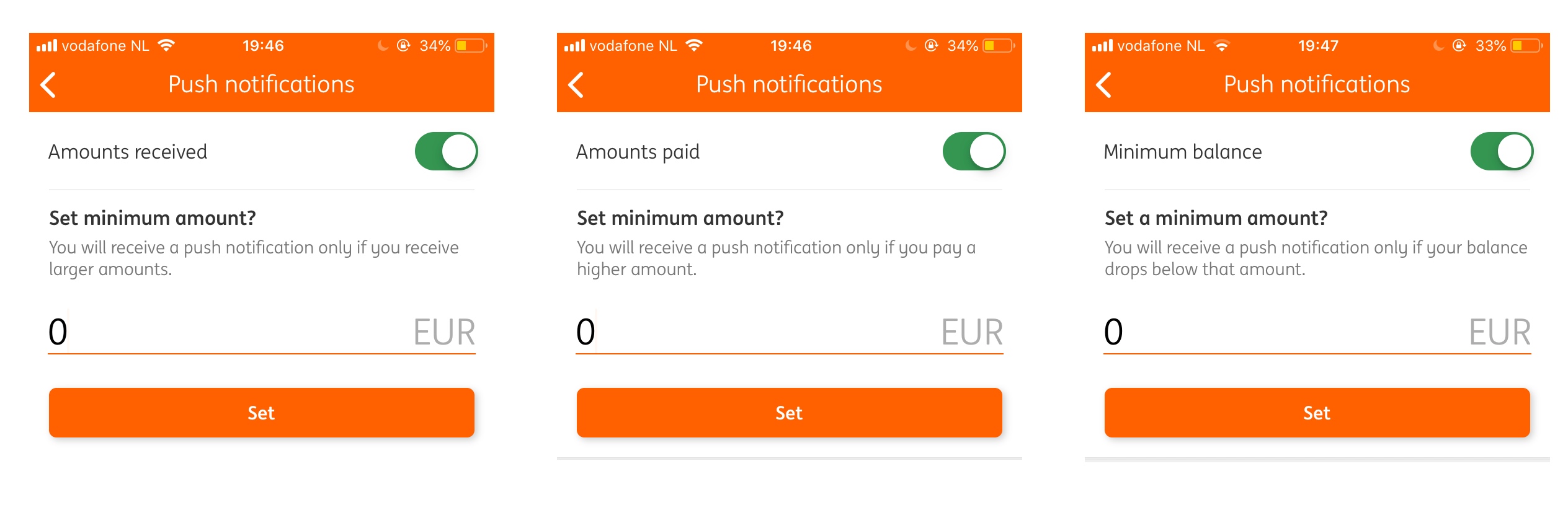
Finding 2
When the last three push notifications “Amounts received,” “Amounts paid,” and “Minimum balance” are turned on. A new screen appears which allows users to edit these notifications based on amounts they set in euros. The instructions as to what to do on these screens is ambiguous.
Severity: 3/4 (Serious usability issue, imperative to fix)
Heuristic violated: Match between system and real world; & Consistency
The instructions as to what to do are confusing due to the language used. “Set a minimum amount?” grammatically does not make sense. It should not have a question mark at the end of it. The subtext below “Set minimum amount?" is also incomplete and feels like it’s lacking clear direction.
Lastly, the preset amount is “0 EUR.” This field should not be pre-filled, users should have the freedom to enter their own personal amount without having to undo text that has been written for them. (See below for image of Finding 2)
Recommendations: In reference to recommendations in Finding 1, the titles of the function should be changed to “Deposit, Withdrawal, and Low balance alerts.” Next, each function should make it clear what the user must do in order to use this feature by being direct. For example, Deposit alerts would state "Set a minimum deposit amount” with a sub-text below stating “You will receive a push notification when money above this amount is added to your account.” (See below for recommended improvement for Finding 2)
Recommendations: In reference to recommendations in Finding 1, the titles of the function should be changed to “Deposit, Withdrawal, and Low balance alerts.” Next, each function should make it clear what the user must do in order to use this feature by being direct. For example, Deposit alerts would state "Set a minimum deposit amount” with a sub-text below stating “You will receive a push notification when money above this amount is added to your account.” (See below for recommended improvement for Finding 2)
Finding 3: Icons should be visible for all Push Notification Settings. Some icons provided are ambiguous and may be misinterpreted.
Severity: 2/4 (Minor usability problem, Fix if there is time)
Heuristic violated: Match between system and real world; and Consistency
In the original Push Notification Settings screen, three of the settings have icons (Amounts received, amounts paid, and minimum balance). The symbols are ambiguous in meaning and don’t serve as accurate metaphors for what they are trying to communicate.
The “Amounts received” icon is the download symbol and “Amounts paid” is the upload symbol. The “Minimum balance” icon should not show a large sack of money as it symbolizes money being plentiful, not dwindling.
Recommendations: Better symbol representations can be found below. The justification for the “Deposit alert” symbol (the hand dropping a coin into a money box) is a metaphor for the physical act of someone depositing coins into their own “piggy bank.” The “Withdrawal alerts” symbol (the hand taking a euro note away) is a metaphor for someone taking money away from another person (symbolically being the customer). Lastly, the “Low balance alerts” symbol (the universal warning symbol overplayed on a euro in a circle) informs the user to that there is a sense of urgency and to pay attention to a financially related warning. (See image in Finding 1 for Push Notifcations above)
Conclusion
In sum, the usability issues identified pertaining to the everyday use of the ING app and its internal features as well as Push Notification Settings were not catastrophic issues that require immediate response.
Aside from the sudden session timeout issue, technically, the app personally evokes a positive experience during use. There are no sudden crashes, no irresponsive features, no erratic errors, the app operates quickly and smoothly, and aesthetically the app has a clean, modern design.
Although for other usability issues, a recurring theme was the ubiquity of mistakes in English translations and descriptions within the app. These mistakes would likely impair the ability for users to navigate the app successfully, therefore compromising user experience. The use of language is of equal value in UX as other visuals and technical features are. That said, it’s critical to keep the audience in mind, especially when users come from multi-cultural backgrounds.
Moreover, since the app is a Dutch app which caters to Dutch speakers, Dutch language still seems to dominate the app. Even when users have their settings switched to "English" many features are still displayed in Dutch such as push messages, banners, and product names.
Lastly, reflecting back on the above problems, there also seems to be a lack of emphasis on intention of certain features, (e.g., Orders, Edit mode Overview screen, etc.) what purpose they serve, who would use them and why they would use them. For example, Push Notifications have been described as “highly desired” by customers who’ve requested this feature. But, what would compel other users to suddenly start using this feature? Why would someone be interested in using Push Notifications? Who is the target audience for this feature? How do Push Notifications positively benefit someone aside from being just another setting in the app?
This is the first heuristic analysis of the ING Bankieren app and certainly not the last as there are is a lot of other territory to cover ranging from features such as iDeal payments, payment requests in-action, products and services, etc.